
BreakFree: From Social Media
BreakFree is an app that uses solo and friend challenges, app blocking, and paid rewards to enable people to take control of their social media usage. As BreakFree's user base continues to grow
we set out to simplify the key feature experience (create challenges, redeem rewards) and shipped new customization features that enable users to track their progress.
Team
• 2 Product Designer
1 Product Owner
• 1 Product Manager
• A team of developers
Role
User Research, Product Strategy, Sketching, Prototyping, UI Design
Timeline
01.2023 - 06. 2023
Tool
Figma; Adobe XD; Adoeb Photoshop; WIX
Impact
+ Improving existing user satisfaction rate by uplifting the product's task creating and subscription experience.+ Validating product solution from a successful launch and user adoption of a new feature that allows clubs to publish their own e-commerce sites.
Discover
MVP 1.0 received negative feedback about usability and need to update for business need.
During the initial research phase with MVP users, a significant number of them encountered challenges in completing the product's core task. Despite the stakeholder's efforts to secure new grants/funding and develop new features, there were unresolved usability issues that persisted.

(Negative feedback from App store review)
Initial Thinking
Target Audience
Research Method
• Students(16 years - 25 years old) who want to build a healthier relationship with social media
• Existing MVP 1.0
• Moscow Analysis
• Competitor Analysis
• Qualitative Research(in-person interviews)
Research
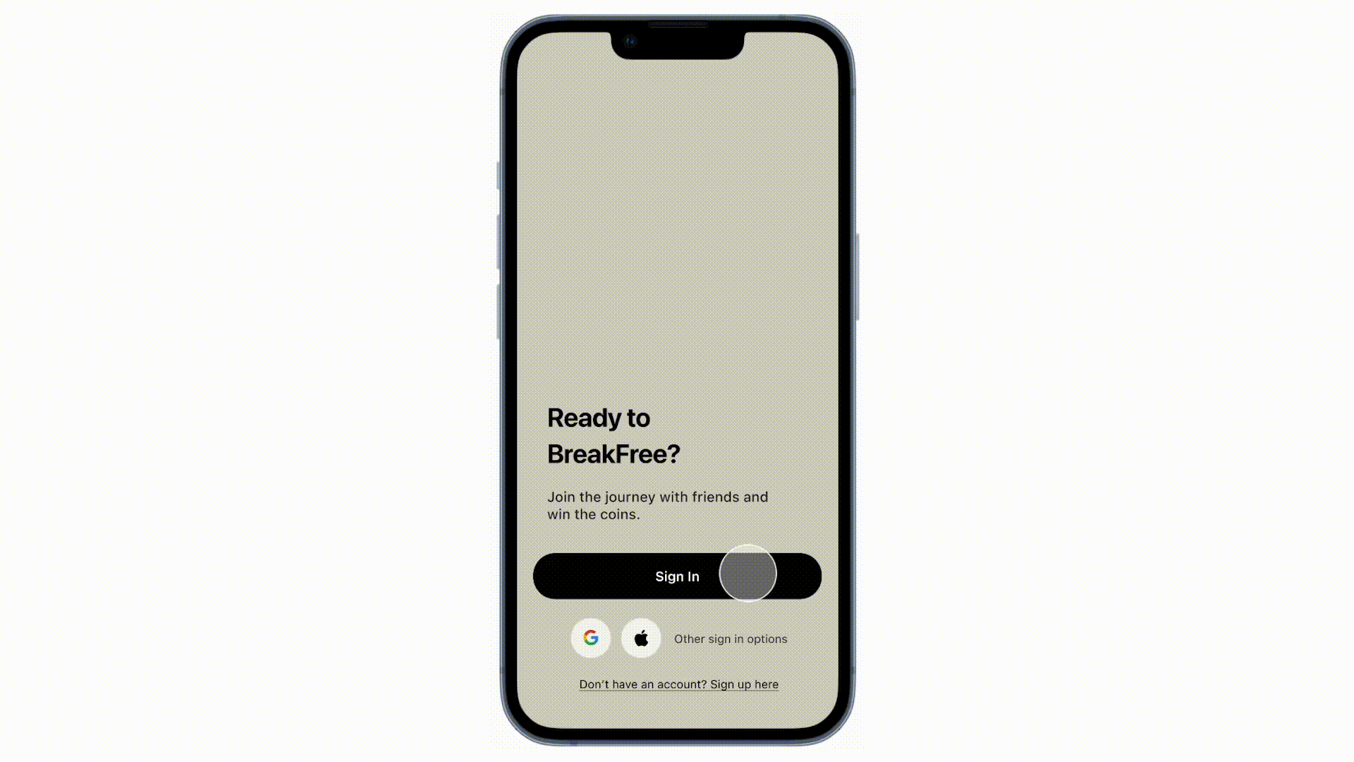
The previous design lacked consistency and exhibited a complex user flow

(BreakFree: from Social Media 1.0)
Findings from in-person interview
-
The onboarding section took 10-15 mins.
-
2 more challenges would block the create challenge button.
-
Couldn’t navigate from home page to friends page.
-
The most frequently use features were creating challenges and browsing coupons.
• Complex onboarding flows
• Lack of customization
• Inconsistent visual element
• No Design System
• Technical problems
• Misuse of spacing
Main Pain Points
-
The hierarchy of the navigation system was confusing
-
The key feature lack of clarity and customisation
-
The in-product experience laced consistency
Goals Statement
-
Optimize the overall user experience
-
Increase Task Completion rate
-
Enhance user retention and engagement rates
-
Align with $50,000 funding business goals
Pain Point 1
The hierarchy of the navigation bar was confusing
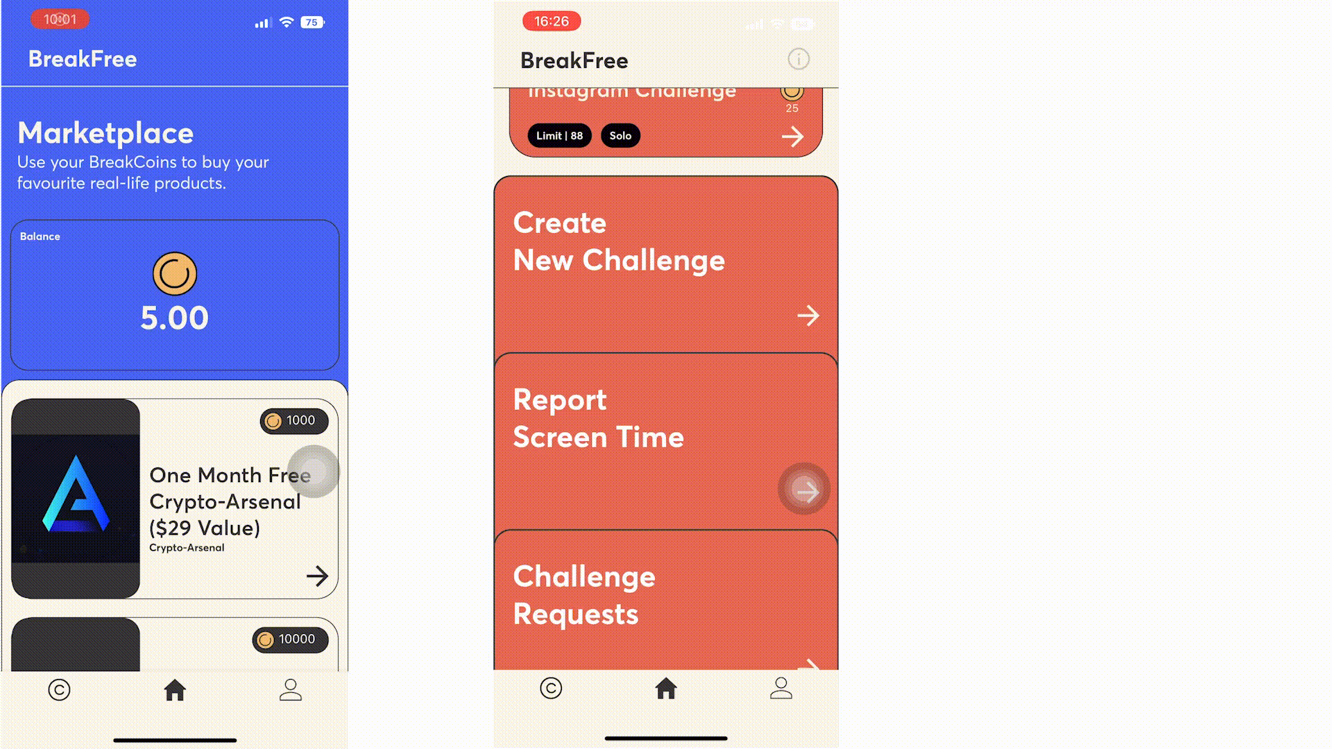
Based on an analysis of user behavior, we employed the Moscow Analysis methodology to thoroughly reassess and refine the hierarchy of each page.
Navigation Bar
Home Page

(Moscow Analysis methodology chart)
Redesigned navigation bar based on user behavior
According to the result of the analysis, we decided to separate our navigation into 2 different hierarchies.
.png)
Prototyping and Testing

Solution
-
Save more space for different challenges
-
Prioritise the key feature
-
Organize the product hierarchy
Pain Point 2.0
The key feature lack of clarity and customization

Competitor Analysis
When discussing app blocking and habit-cultivating apps, "Forest" serves as both our competitor and subject of analysis. We conducted an examination of its information architecture and user flow, gaining insights into the app's overall cleanliness and design.

( Forset & Opal)
New Challenge Mode
Daily Limit
Limit the time you spend on social media in a day
Focus
Challenge how much time you can get rid of social media
Feature Iteration
The key feature lack of clarity and customization
-
Users are able to choose specific apps
-
Users can switch between different mode
-
Users can have solo/group choices
-
Users can choose to repeat the challenges

Version 1.0
Version 2.0
Version 3.0

Version 4.0
Final Create Challenge User Flow

Pain Point 3.0
In-product experience lacked consistency
Users need to jump between apps to share challenges & report screen time.
Design Solution
In order to keep the consistency in the application, we decided to move the coupon code directly into the marketplace, after the user redeemed the coupon, they can directly follow the website to redeem rewards. This design also increases partent companeis's exposure.

Our back-end developers find the way to directly connect screen time API to our app, so the users don't have to jump back and forth to take screenshot.

Solution for
Pain Point 2.0 + 3.0
-
Seamless and consistent in-product experience
-
Enhance user satisfaction rate by bringing custmized option
-
Improve technical API
Final Design

Key User Flow from Create a Challenge to Redeem Rewards
-
Improve visual hierarchy and enhance the overall design.
-
Effective utilisation of space enhances the user experience.
-
Users enjoy greater customisation options.
Impact
Build a community and expand the scale of the product

Feedback on App Store after Release

Business milestone
Take Away
As the UX designer on this project, I honed my skills in conducting usability testing despite time and budget limitations.
I also gained expertise in successfully communicating and delivering designs to developers, even in their absence.
Additionally, I developed the ability to confidently express and defend my design decisions when met with disagreements. This valuable experience not only boosted my confidence but also reaffirmed my dedication to becoming a highly skilled designer.